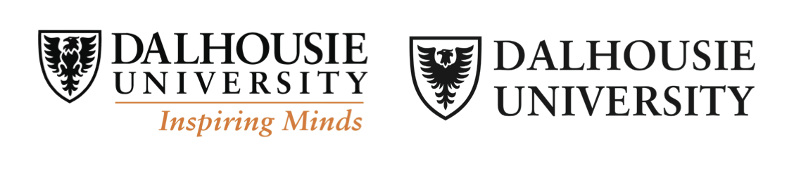
Dalhousie changed its new logo by removing its tagline of 11 years, “Inspiring Minds.” The logo now contains an eagle in a crest and “Dalhousie University” written out in a bold, all-caps font.
“It’s a fresh and bold place, so we wanted a logo that looked cleaner, fresher,” says June Davidson, Dal’s director of marketing. “Without the tagline, it’s just: here we are, we’re Dalhousie, we’re boldly here.”
Davidson added that a brand tends to refresh its logo every five to seven years. With the arrival of President Richard Florizone and his new strategic plan, and a university with more people and research, it seemed like a good time to refresh Dal’s logo.
In 2003, the university was trying to understand the world outside of it. Dal had 90 versions of a logo at the time and didn’t have a cohesive understanding of its reputation.
Research was done, and the university decided that “Inspiring Minds” would be the ideal tagline to draw in every audience Dal interacted with – from prospective and current students to parents, alumni, researchers, funders, potential employers and faculty.
Davidson says post-secondary education has become very competitive. Before 2003, businesses were mainly the ones concerned with visual identity, but universities were forced to adapt business strategies to continue drawing substantial amounts of people and money.
Dal’s new logo comes with an updated brand. Its attributes, outlined by the university’s official brand guide, are: pioneering, inspired, purpose-driven, connected, influential and open. The personality of the brand is described as “a bit of swagger that is Fresh and Bold.”
“Whatever you do with helping to shape a brand has to apply to anyone,” Davidson said. “They all have to be able to feel what the essence is that you’re trying to convey, it has to mean something to everyone.”
The brand guide lists target demographics who could connect to Dal’s refreshed logo. Examples include “a pharmaceutical company headquartered in Switzerland looking for a scientific breakthrough,” and “a philanthropic family in Halifax looking to cement their legacy.”
Katie Wuytenburg is the student council president of Medway High School, located in Arva, Ont.
Wuytenberg wants to study nursing next year, and Dal is one of her options. She, a student council president in Southwestern Ontario, is an example of someone listed in the brand guide who could connect to the refreshed logo.
“It’s open: Dalhousie University with a little logo on the side,” Wuytenburg said. “It’s nothing too extravagant, it’s just nice and easy-going.”
A “post-doctoral fellow in the Midwestern United States looking to make his mark” was another example of someone who could connect with the logo.
The Gazette interviewed a post-doctoral fellow of social work at the University of Michigan, who now teaches social work at Fordham University in New York. She asked to remain anonymous.
“While the eagle is in many countries, my first reaction was U.S. patriotism,” she says via Facebook. “I felt a need to double check that this was a Canadian university.”
When “Inspiring Minds” first hit Dal’s logo, taglines were en vogue. But Davidson noticed many universities, particularly prominent ones like the University of Toronto and McGill, are not using taglines anymore.
In consultations for Dal’s refreshed logo, there wasn’t even any talk of a tagline.
“Dalhousie is well-known, everything tells us our reputation is getting stronger all the time,” says Davidson. “It’s Dalhousie’s reputation, not the tagline’s reputation.”
Recent Comments